Optimizing Access to Market Research Insights For Business Executives
Project Overview
Market Research Future (MRFR) is a global market research company that delivers market analysis reports across 13+ industry sectors.
Their web platform was struggling with poor user engagement and low conversions. Leading this design initiative, my goal was to transform the platform into a subtly guided experience
Need For Redesign
Business Opportunities
Increase platfrom browsability and cross-selling opportunities
Scaling the platform to incorporate new range of reports.
Build better credibility and trust to drive conversions.
Usability Needs
High drop-out rate at the report summary page due to poor comprehension.
Making the design adaptive for increasing number of mobile users.
My Roles and Responsibilities
Effort Estimation
Requirement Engineering
User Research
UX and UI design
Project Management
Team
Product Designer (Myself), Marketing Executive from MRFR, Lead Researcher from MRFR, Front End Developer
Based on extensive discussion sessions with the marketing team, Insights from Site Analytics and a few casual conversations with existing users
Primary Users
C-level executives, VPs, investors, and marketing/sales professionals seeking reliable market insights to guide decision-making.
Why Users Need Market Research Reports
Identify opportunities for market entry
Scope potential for new offerings within existing businesses
Explore markets for investment prospects
Conduct competitive analysis for pricing, business, and market strategies
Plan future operations based on current trends and emerging opportunities
How Users Make Purchase Decision For Market Reports
Level 1: Relevance Check
Does this report focus on my exact market, segment, and opportunities?
Does it provide relevant competitive insights for my needs?
Level 2: Depth & Scope
What is the precise scope covered in this report?
What specific topics and insights will be covered?
Level 3: Trust & Validation
Is the platform credible and the reports worth the price?
Are customization and flexibility options available?
Other Key User Behaviors
95% of users are only concerned with specific industry sectors.
Purchase decisions are primarily influenced by four report elements: market size, key players, opportunities, and trends.
The main CTA is “Request sample” instead of “Buy Now”.
Only ~4% of users purchase reports directly through the platform, rest happens after consultation with sales team.
2. UX Audit
Did page-by-page analysis of the website by benchmarking against standard industry practices and analytics data (like heatmaps and scroll maps) to find out where current users are getting stuck.
Primary Issues Found
Inconsistent global navigation
Confusing terminology/labels
Improper feedback on actions
Inconsistent design patterns.
Poor utilization of space in page layouts.
Non-semantic information grouping
Secondary Issues Found
Missing breadcrumbs and back-navigation
Non-persistent filters & lacking advanced options
Low text contrast ratios
Missing hover states or interactive cues
Non-sticky filters that scroll away
Opportunities for Improvement
Consistent and scalable navigation which provides balanced guidance and control to the user.
Visual and Interaction Consistency with proper feedback can make user experience smoother and their workflows faster.
Using industry standard and proactive taxonomy can prevent confusion.
3. Design
There were three major goals for the design – Make the reports easier to find & Make the report summaries easier to comprehend and guide the users to stay on the platform and explore more reports.
User Centered Design Goals
Make Reports Easier To Find
Make Reports summaries to understand and facilitate purchase decision.
Encourage new users to adopt the platform for their further needs.
Overall design of the platform (primary and secondary screens) to be unified and visually cohesive.
Note: The live version still has a few and gaps which we are working to fix soon.
Goal 1 - Making Reports Easier To Find
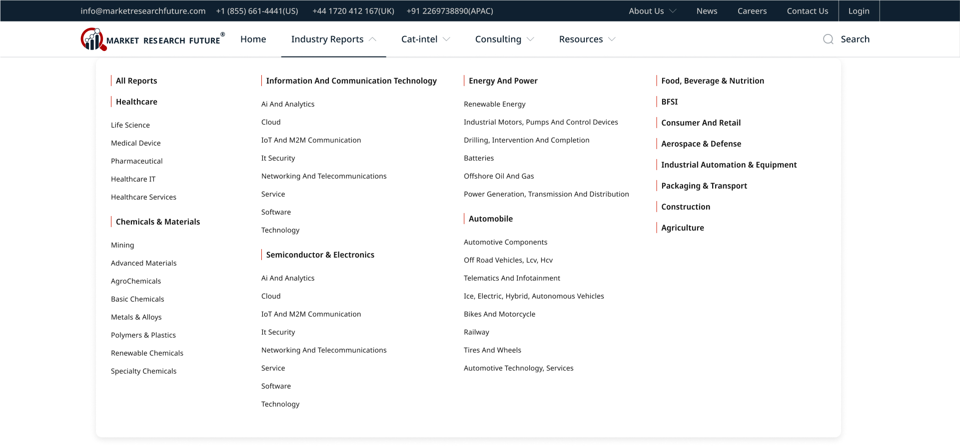
Navigation Redesign
Two-tier primary navigation to distinguish between transactional* v/s non-transaction pages.
Simplified and Scalable user flow for accessing reports.
Improved taxonomy for better understanding.
Mega-menu** and global search help find relevant info faster.
Contact info and action brought upfront for lead generation.
*Transactional pages here mean the pages which directly or indirectly lead to the flow for purchasing a report or service from the company.
**A mega menu is a large, panel-style dropdown navigation system that displays multiple columns of content, links, and even multimedia elements when a user hovers over or clicks on a menu item.
Fig. 1: New Two-tier Navigation Design with Mega-Menu
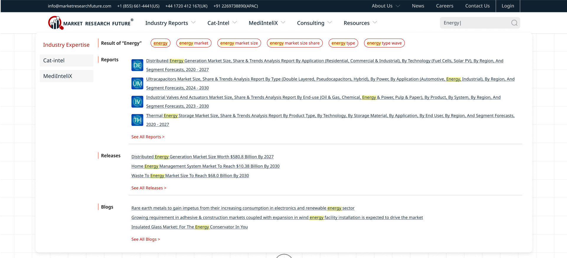
Search Experience Redesign
The new search feature was designed keeping in mind the wide range of content types available across multiple categories.
Mega-dropdown shows items with the matching keyword across reports, press releases, articles and blogs.
Searched keyword is highlighted in the results to help the users map the results to their search query.
Fig. 2: Search Interface
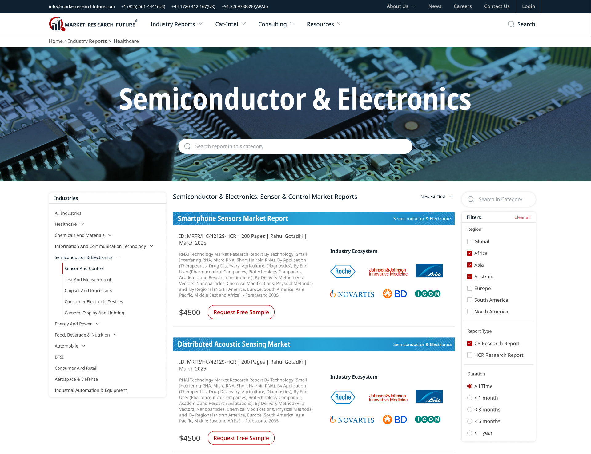
Report List Page
Key features of the Report List page:
Custom header background for every industry category for faster recognition.
2-tier Industry Filters on the left side of the page.
Advanced filters for region and report type on the right side
Sorting by date introduced which was missing in the old design.
Report widgets for every industry category have a thematic visual language which translates to all occurrences of reports for the specific industry across the site (see next section)
Fig. 3: Report List
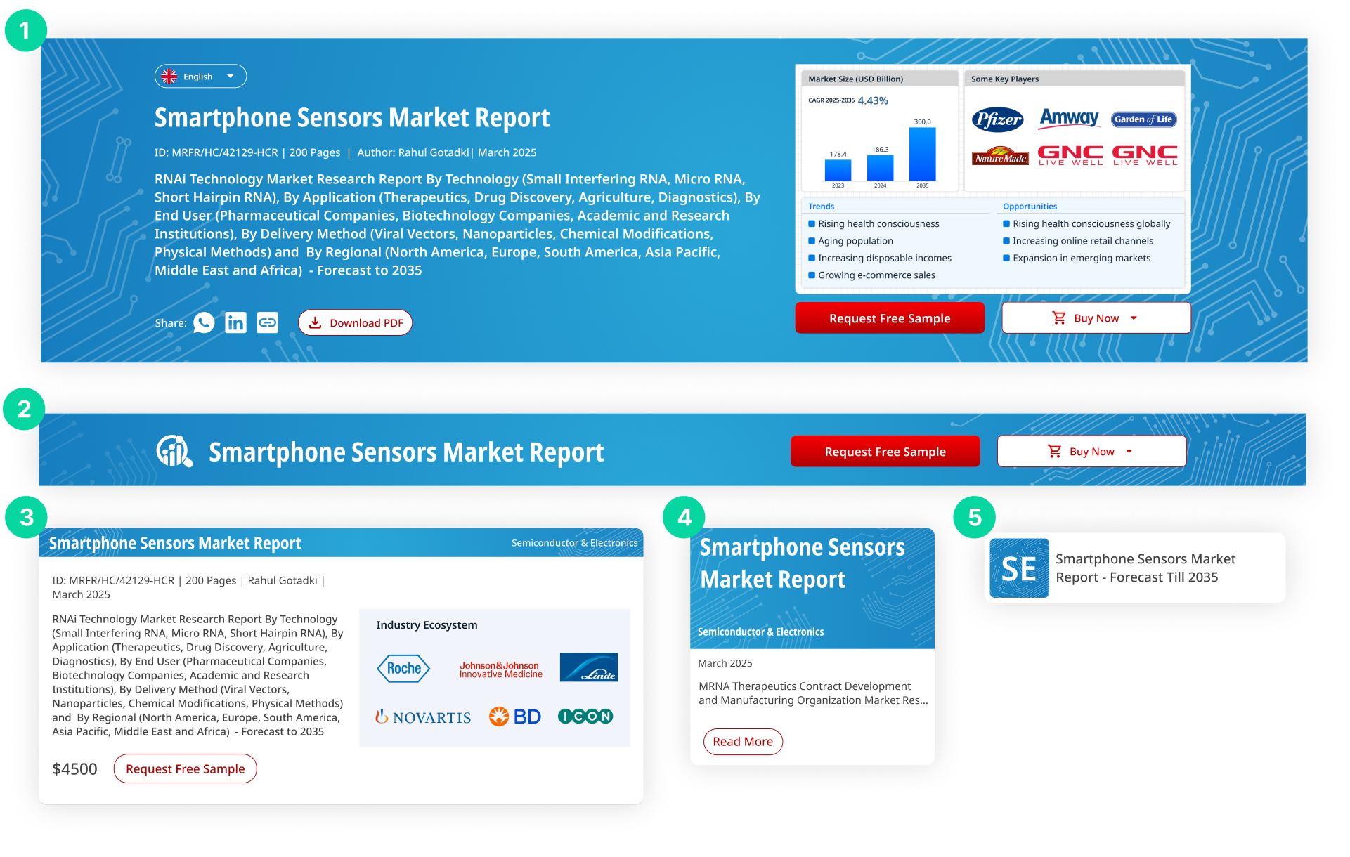
Designing Report Widgets With Consistent Design Language
A Specific report may appear on the website in multiple ways:
Report Summary page (Header Design)
Report Summary Page (Collapsed Header Design)
Report List Page (Large Widget)
Suggested Reports in other pages (Medium Widget)
Related Reports Cluster (Small Widget)
For all the occurrences of the report for a specific industry, a common visual language is carried along for quick identification of the industry sector. (Since one user will mostly be concerned with their own industry sector)
Fig. 4: Variations of Report Widget for different Occurrences
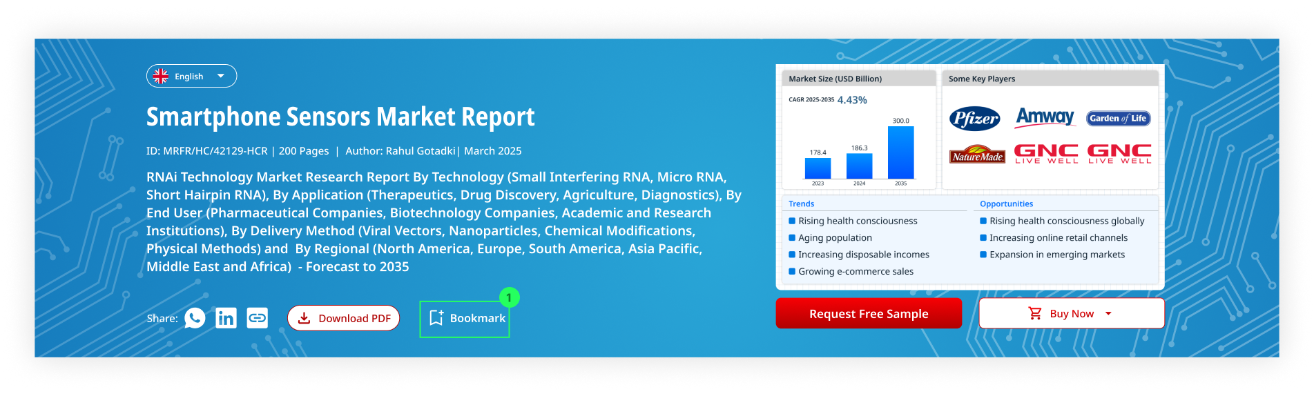
Goal 2 - Making Report Summaries Easier To Comprehend
Report Summaries - Reducing Decision Time
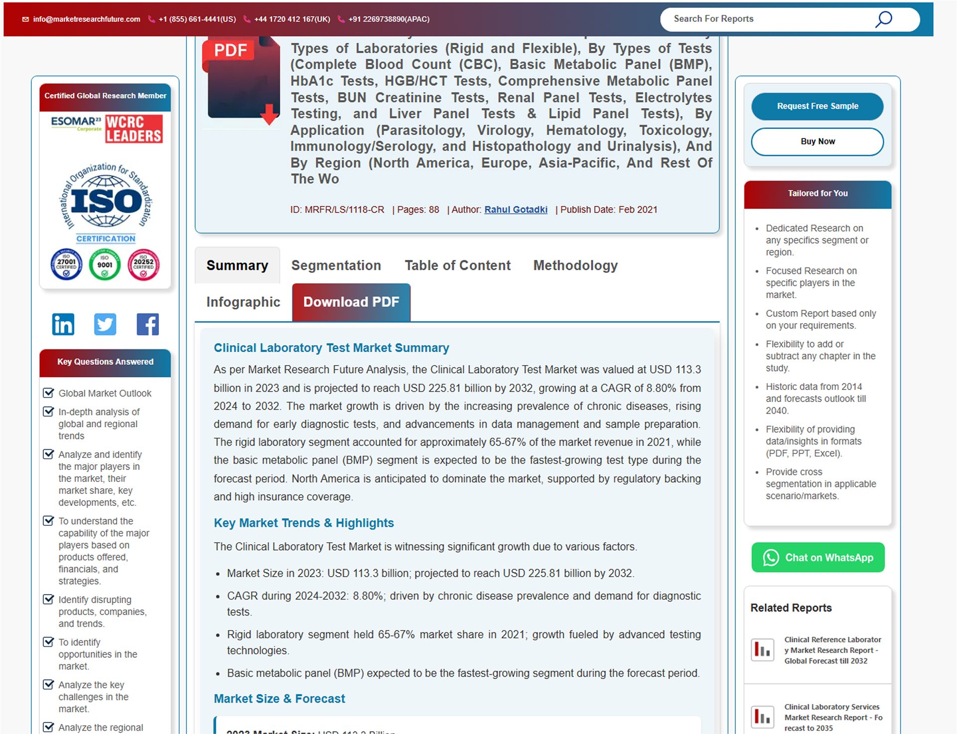
Fig. 5: Old Report Summary Page
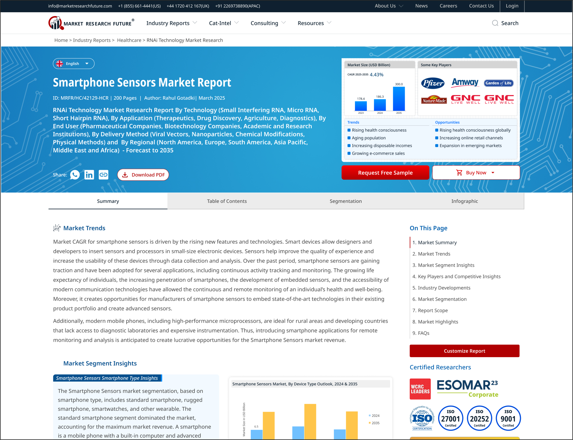
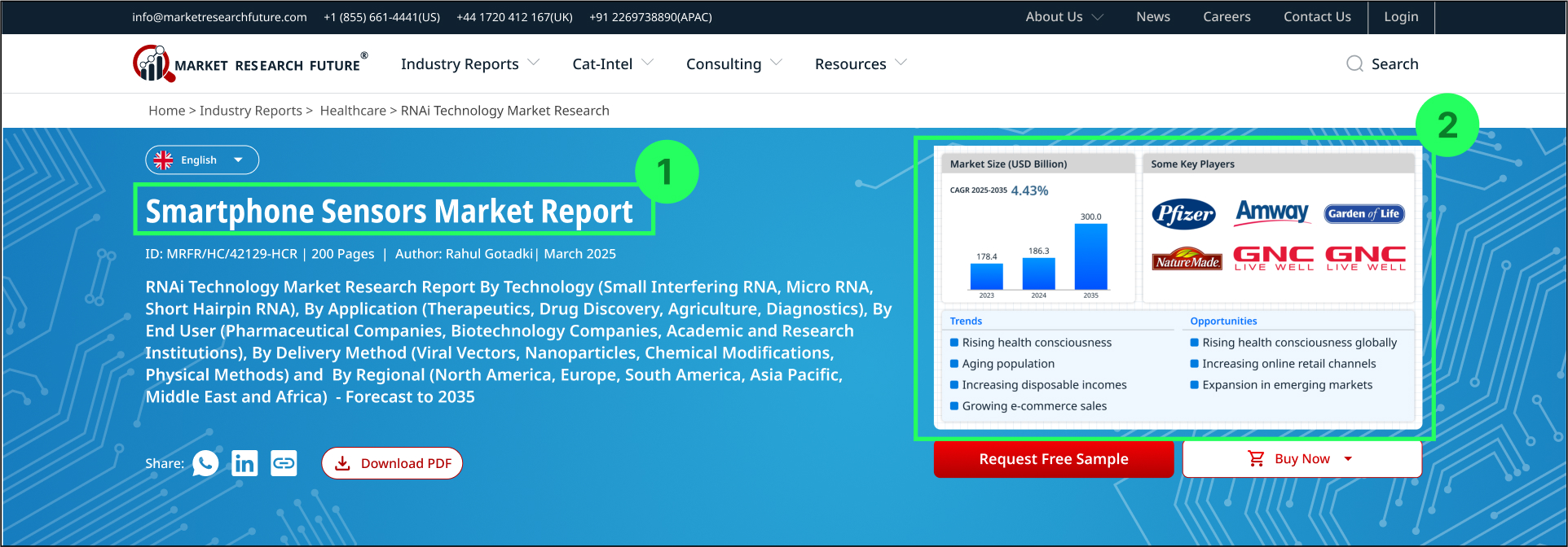
Fig. 6: Redesigned Report Summary Page
Helping the user make level -1 decisions
Level 1 Decision: Relevance Check
Does this report focus on my exact market, segment, and opportunities?
Does it provide relevant competitive insights for my needs?
Adding an additional short title in large font to show the exact market segment
Summary infographic showing Market Scope, Competitive Landscape, Market Trends and Opportunities in the header.
Adding a thematic background design for each industry sector for better recognition.
Fig. 7: Report Summary Header
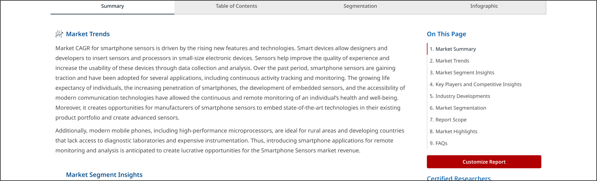
Helping the user make level -2 decisions
Level 2 Decision: Depth & Scope
What is the precise scope covered in this report?
What specific topics and insights will be covered?
Side menu for user to quickly scan the sub-headings of the summary. Moreover the menu is persistent and interactive so the user can jump to the desired section in the summary.
Fig. 8: Snapshot of Report Summary Showing the Side menu at right side.
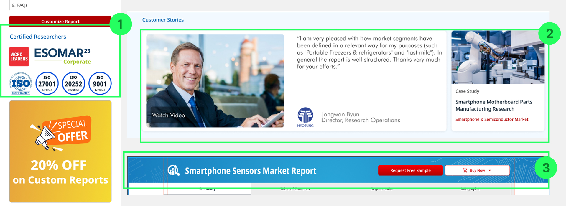
Helping the user make level -3 decisions
Level 3 Decision: Trust & Validation
Is the platform credible and the reports worth the price?
Are customization and flexibility options available?
Highlighting certifications in the sticky side menu without hindering functional area.
Customer testimonials and case study below the report to build social validation.
Keeping the CTA buttons always accessible in a sticky header on scroll.
Fig. 9: Snapshots of different parts of the report summary showing Certifications, Case studies and Collapsed header (persistent)
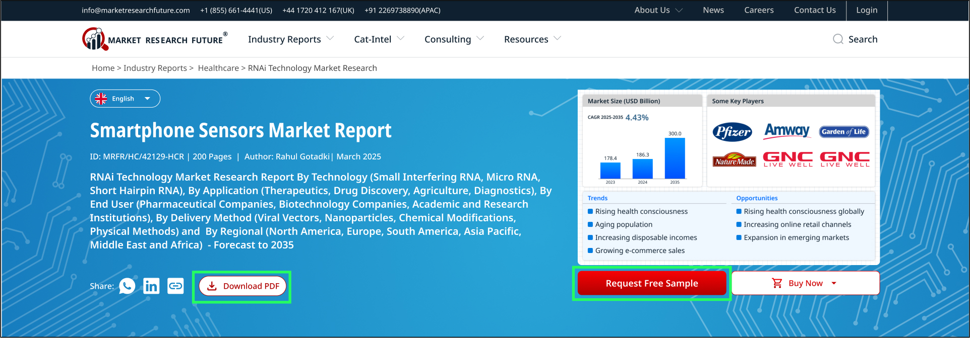
An unusual Insight: A Lesson on Semantics
“Download PDF” and “Request free sample” buttons both have the same functionality, so design logic says to keep only one of them to avoid confusion.
But data begs to differ. According to site analytics, users from America and Europe mostly click on “Request free sample” and users from Asia Pacific region mostly click on “Download pdf”.
So we decided to keep both the options available to avoid the risk of drop-out at the final stage.
Although we want to eventually move to having just “Request Free Sample” button, so it is given more visual weightage.
Fig. 10: Report Summary Header showing two buttons ‘Download PDF’ and ‘Request Free Sample’ for the same functionality
Goal 3 - Encouraging Users Stay on the Platform
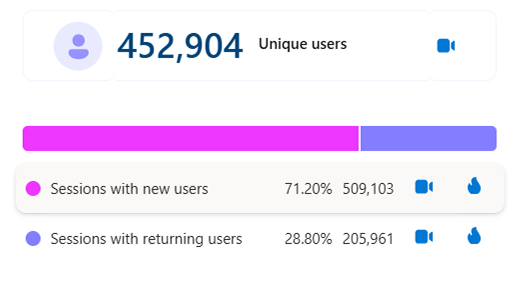
About 70% sessions on the platform are from new users which reach through marketing funnels. Only 30% of the total users come back to the platform. The major reason being that users coming from direct link either find it difficult or don’t bother to explore the rest of the platform for more adjacent information.
Fig. 11: Screenshot from Microsoft Clarity
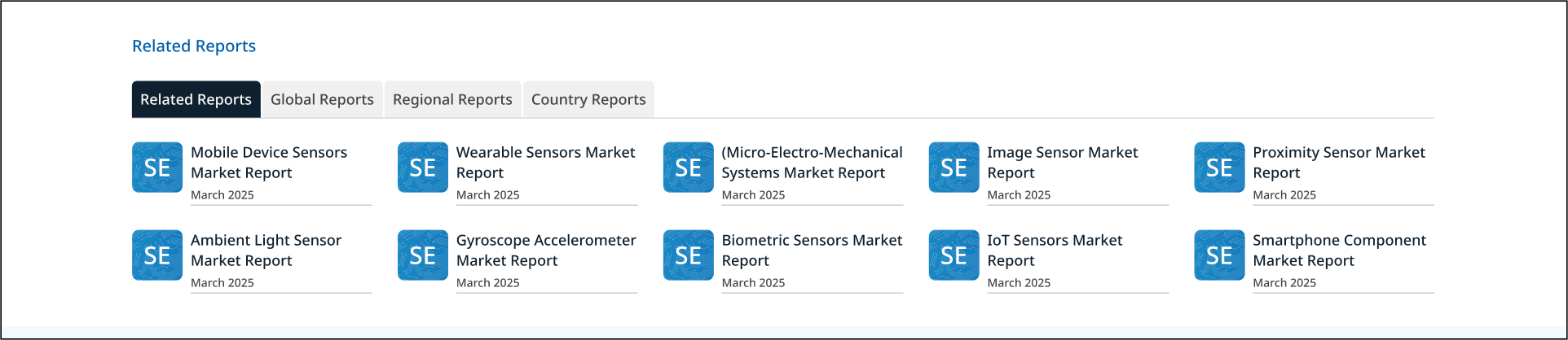
Solution 1: Related Reports Suggestion
A well structured and categorized ‘related reports’ section was designed to help users explore connected topics. This improves content discoverability, encourages multi-page browsing, and strengthens the platform’s role as a comprehensive market insight hub.
Fig. 12: Related reports section at the bottom of report summary
Solution 2: Bookmark Reports fo Later
A “Bookmark” feature was introduced, allowing users to save reports that interest them, creating a personal library for future reference. This encourages users to revisit the platform and continue their exploration. Since implementing this with a user login required additional infrastructure, this enhancement is planned for the next phase.
Fig. 13: Report header concept with a “Bookmark” feature added
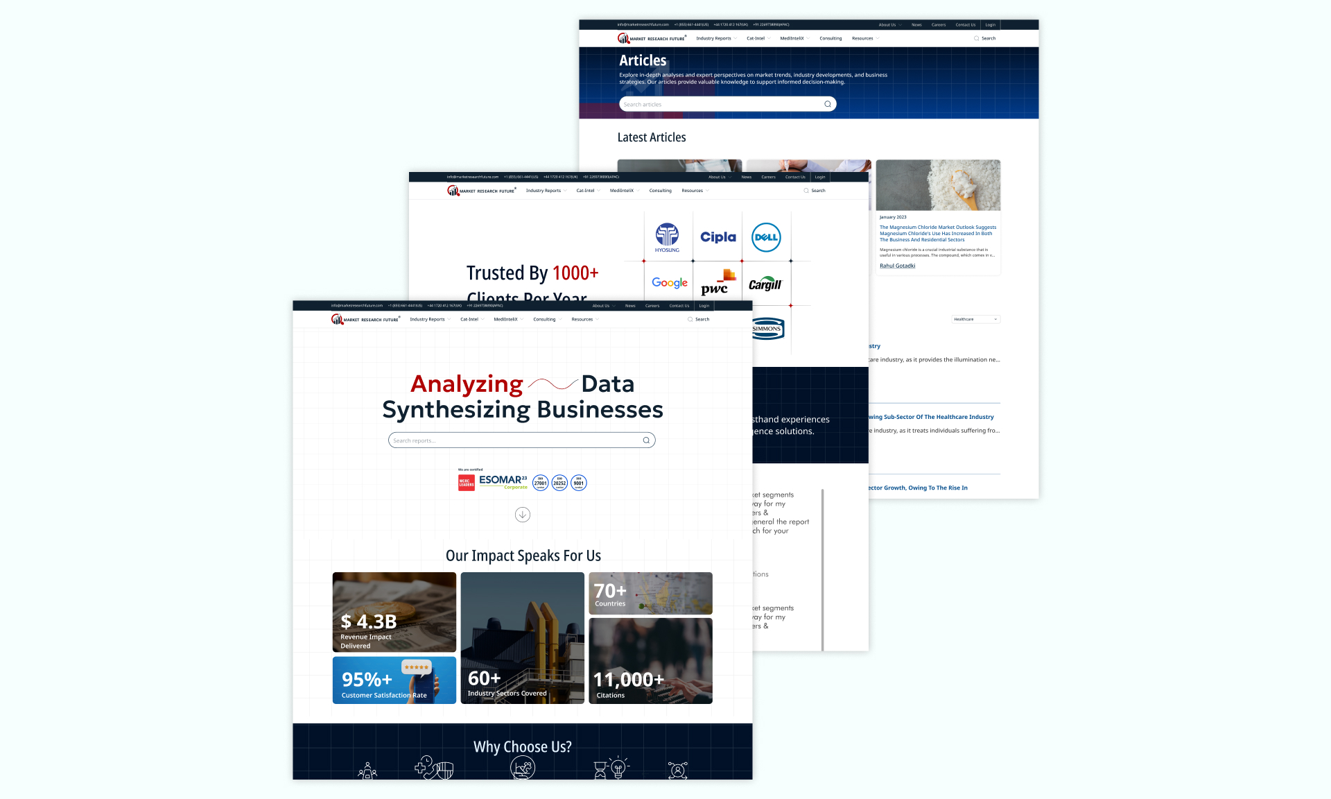
Goal 5 - Design of 50+ other pages
Apart from the Key Transactional Flows and Screens, a major chunk of the project also involved the design of the rest of the website which included more than 50 unique screens like Home (3 landing pages for different Report Types), Articles, Blogs, Payments, Enquiry Forms, Blogs, Press Releases, etc…
Fig. 14: examples of other pages designed
4. Validation
A preliminary user feedback was taken on the figma design, but the main validation is yet to be done based on actual site analytics once the developement is complete.
Impact
As observed and measured through screen recordings and click maps of 15 new-user trial sessions distributed across ‘MRFR old platform’, ‘ MRFR redesigned platform’ and ‘competitor platform’. The parameters to be tested emerged from the design goals defined in the previous section.
25% reduction in ….
16% faster CTA clicks in high-intent users
Way Forward: Key Metrics To track and Expected outcomes
Increased pages per session
Path exploration (Increased number of paths through navigation menu)
Reduced session time during keyword search
Reduced session time on report summary for high-intent users (because of faster comprehension)
Higher scroll depth in report summary (because of interactive side menu)
Reduced drop-outs from search page
Reduced drop-outs from summary page
Increased conversion rate through mobile devices
My Learnings
Working Alongside Marketing Team, I got the opportunity to design something which balances user needs and business needs. We had to take some difficult decisions along the way but keeping in mind our common objectives we were able to push through them.
Working with marketing team and development team at the same time was a tough lesson in project management.
Exposure to tools like Microsoft clarity was a big insight on the various types of user activity that be tracked.
Lastly, now long market reports don’t intimidate me. I can now look for and understand reports about any business opportunity I am curious about.